Organizant
Appointment Booking App · UX/UI Design + Branding
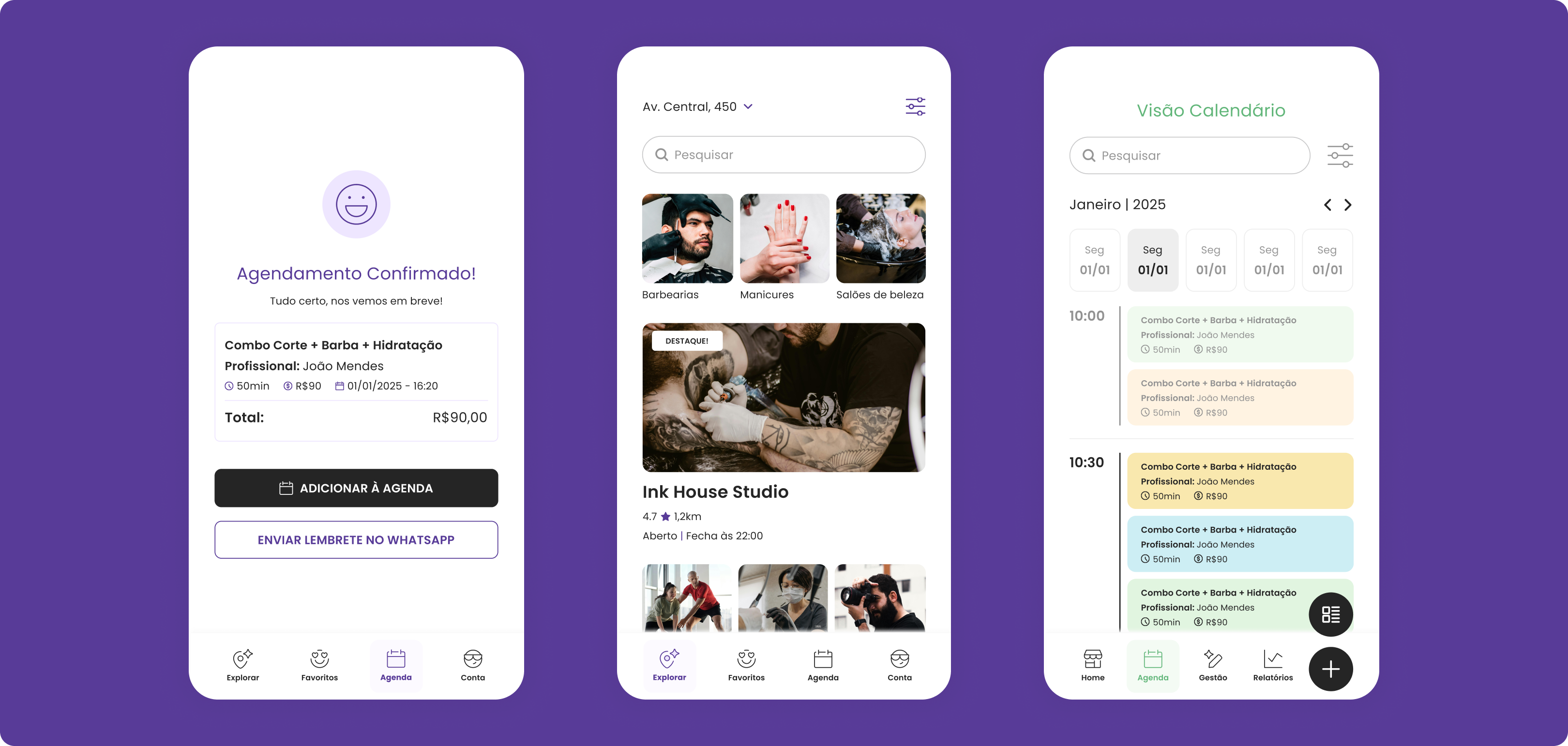
Appointment Booking App · UX/UI Design + Branding
Booking a haircut shouldn't feel like filing a tax return. But for most people — and especially for the small business owners on the other side of that booking — it does.
The idea for Organizant came from a real frustration: the customer of a barbershop found the existing booking tools unnecessarily complex and bureaucratic, too many steps just to book a simple haircut. Nothing felt built for the people actually using it.
I co-designed this project with Lana Dandara, working together across the full process, from initial research through to developer handoff. In addition to the shared UX work, I owned the branding entirely: logo, colour system, typography selection, and the visual identity that runs through the whole app.
01 — Discovery
We started by interviewing the business owner directly, mapping his current workflow, understanding where clients dropped off, and identifying what he actually needed to manage his team and schedule day-to-day.
02 — Benchmark Research
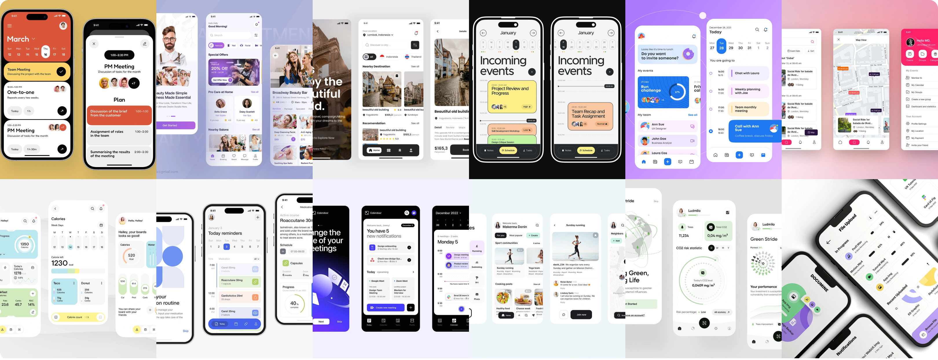
We surveyed the existing landscape of booking apps, both direct competitors and adjacent products, to understand what patterns users already knew, where existing solutions fell short, and where there was room to do something better.
03 — User Flows
We mapped separate flows for two distinct user types: the client booking an appointment, and the business owner managing their services, team, and schedule. We later added a third flow for business employees, who needed their own view without access to the full admin layer.
04 — Branding
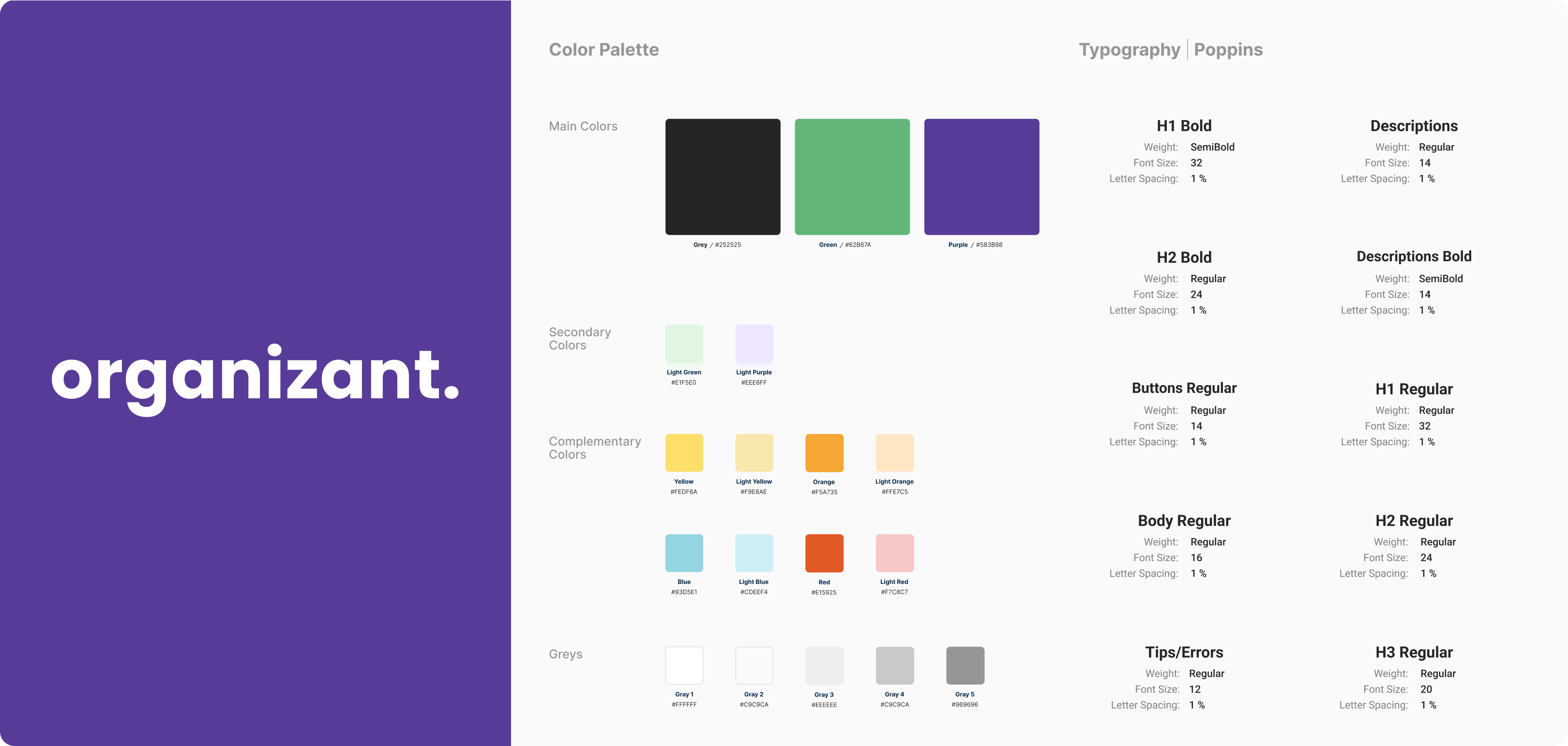
Logo, primary palette, secondary and accent colours, grey scale system, and a typography study that led to Poppins, chosen for its geometric clarity, legibility at small sizes, and friendly character. The type system covers 10 defined styles from H1 to micro labels.
05 — Prototype & validation
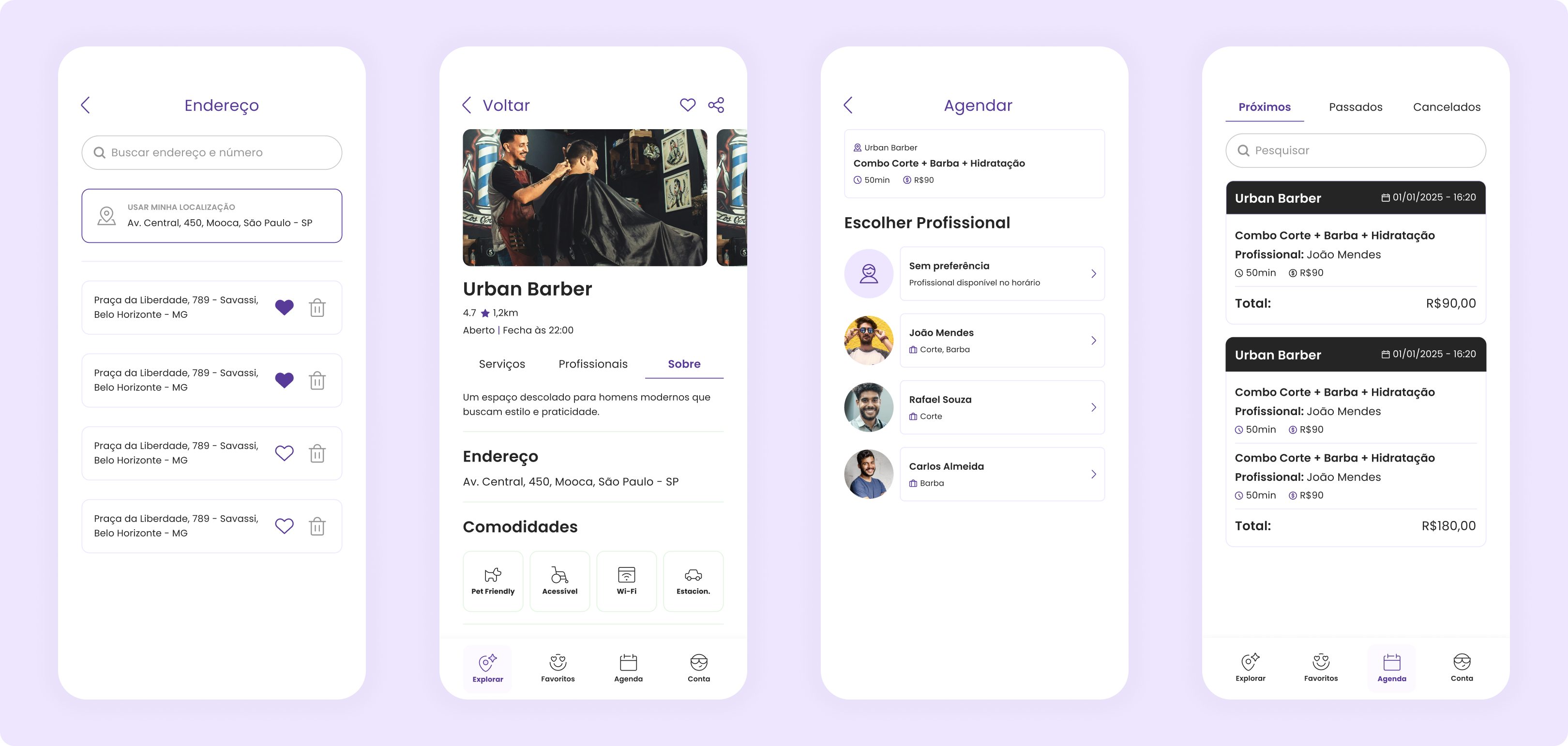
Full interactive prototype in Figma covering all three user flows, with back-and-forth validation until final approval. Assets were then organised for developer handoff.
Key decision 01
Client and business flows are very different in complexity. We designed them as distinct experiences that share the same visual language.
Key decision 02
Every step in the client flow was tested against one question: does this add a step that doesn't need to be there?
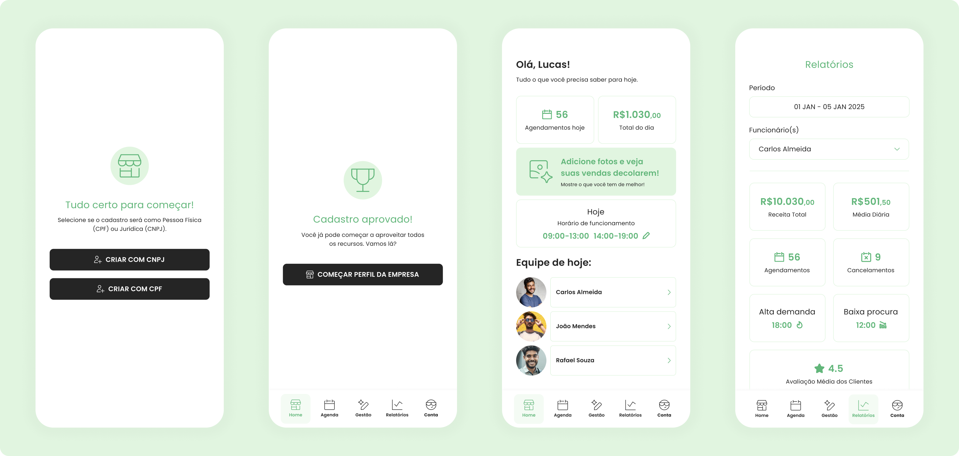
A fully shipped mobile app available on iOS and Android, covering booking flows for clients, management flows for business owners, and schedule views for employees, all built on a complete design system and brand identity created from the ground up.
Tools: Figma · FigJam · Custom Design System